
Readiness Dashboard
Readiness Dashboard — Unifying Mission Readiness Visibility Across Command Levels
🟥 Problem
The 521st Contingency Readiness Squadron lacked a centralized, real-time system for tracking unit readiness across personnel, equipment, and operational status.
Readiness data was distributed across multiple outdated systems, creating:
Fragmented visibility across command levels
Delays in accessing critical readiness status
Inconsistent and duplicated data entry workflows
High cognitive load for users switching between systems
Limited ability for leadership to assess readiness in real time
As a result, even routine readiness assessments were time-consuming and inefficient.
🟨 Objective
Design a unified readiness dashboard that enables Airmen, supervisors, and commanders to:
Access real-time readiness data
Reduce system fragmentation
Improve task efficiency and situational awareness
Support faster, data-driven decision-making across command levels
🟩 Approach
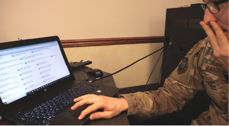
1. Field Research (On-Site Discovery)
Conducted a two-day on-site discovery session at McGuire Air Force Base with Airmen, Supervisors, and Commanders.
Methods included:
Contextual inquiry (observing real workflows in operational environments)
Focus groups across rank levels
Cognitive walkthroughs to identify usability breakdowns
2. Key Findings
Across all user groups, recurring issues emerged:
Difficulty accessing critical readiness data quickly
Frequent switching between disconnected systems
Lack of unified operational overview
Absence of intelligent prioritization for tasks and alerts
A recurring sentiment from leadership:
“We’ve got so much great data out there that’s not filtered and not accessible like it could be.”
3. UX Synthesis & Structure
Synthesized findings into:
Role-based personas (Airmen → Commanders)
Empathy maps highlighting workflow friction points
End-to-end journey maps for readiness assessment workflows
This informed a role-based information architecture designed around decision-making needs.
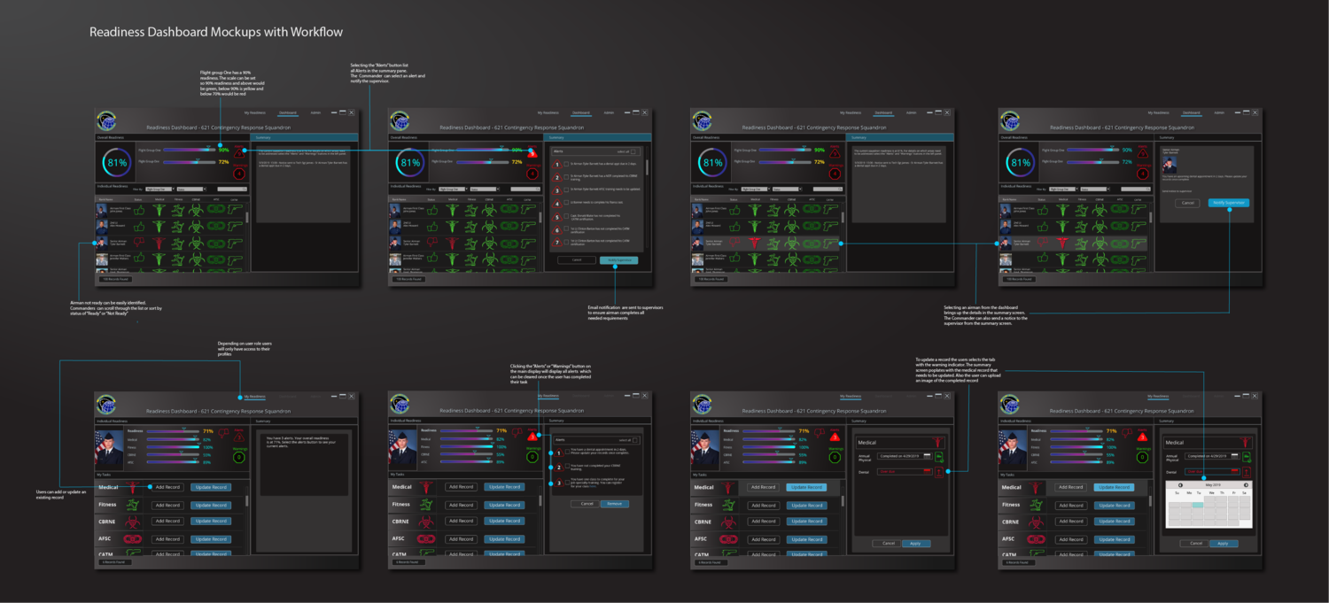
4. Interface Design
Designed a unified dashboard experience focused on clarity, speed, and operational awareness.
Key design elements included:
Role-based dashboards tailored to Airmen, supervisors, and commanders
Visual readiness indicators for rapid status comprehension
Progress tracking for unit and individual readiness levels
Task lists with alerts for overdue or critical actions
Consolidated workflow for viewing and updating readiness data in one system
5. Usability Testing & Iteration
Conducted usability testing with stakeholders using a coded interactive prototype.
Key insight uncovered:
Users needed the ability to compare readiness states across time and units.
In response, I added:
Dashboard comparison functionality for trend analysis
Enhanced filtering for cross-unit evaluation
🟦 Solution
The final design delivered a centralized readiness intelligence dashboard that unified fragmented systems into a single operational view.
It enabled users to:
View real-time readiness across units
Reduce system switching and duplication
Identify gaps and priorities quickly
Compare readiness trends across time and units
🟪 Results
While full deployment is pending backend integration, the projected impact includes:
Estimated 5,200+ man-hours saved per wing annually
Significant reduction in time spent aggregating readiness data
Improved clarity for commanders making operational decisions
Streamlined workflows for Airmen and supervisors
🟧 Strategic Impact
This project demonstrates how UX-led consolidation of fragmented operational systems can directly improve mission readiness and decision speed in military environments.
It reinforces the value of designing for multi-role, hierarchical systems where clarity, speed, and accuracy directly impact operational outcomes.